I'm now studying Architecture at The University of Auckland, and part of my course is keeping a blog. In this blog I will be posting my work, and work from other architects, designers and artists that inspires and influences what I do.
Monday, 25 March 2013
Studeo_Studio Grid
The grid has arrived, and we're now filling it with out studios! A futuristic housing complex perhaps?
Wednesday, 20 March 2013
The Cabinet of Dr. Caligari
Sunday, 10 March 2013
City Sights
Really enjoying the opportunities I now have living in Auckland to practise my photography of architecture. This is a view from my balcony, planning on heading out with my camera one afternoon soon and taking on the city.
Fun with ArchiCad
My first go trying out ArchiCad. We were encouraged to 'mess around'.
I think I show a lot of promise.
I think I show a lot of promise.
Swedish Prefabs
Claesson Kovisto Rune: Tind Prefab Houses
Really great example of pre-fabricated homes, something I'm thinking about with Studeo_Studio. I think the recessed windows are very visually interesting, and I always love the lightness of Scandinavian interiors. Great to be able to see the drawings at the bottom as well.
Saturday, 9 March 2013
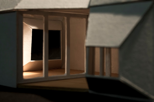
Studeo Models
My first model to explore the studio. I have been focusing on the different ways to allow light into the space and the casting of shadows to create geometric shapes inspired by Eliasson's Reimagine.
Friday, 8 March 2013
Studeo_Studio
The image
of Olufur Eliasson’s Reimagine,
grabbed my attention very quickly because of its illusion to perspective. The
two dimensional projection seems to perfectly capture the concept of turning 2D
to 3D, by arranging trapezoidal shapes into the suggestion of a room.
The main
response I had to Eliasson’s image (other artists including James Turrell, Dan
Flavin, Chillida) was my fascination with the light defining spaces within a
space. Does a room feel larger or smaller, when separated into specific
segments and/or defining each wall from the others? The smoke of Eliasson’s Your Blind Movement would surely feel
claustrophobic, yet the border of the space you are occupying is unapparent.
 |
|
S. Maria
Annunciata, in Chiesa Rossa
Dan Flavin, ‘Untitled’, 1996. Photo: Daniele Aulenta |
The differentiated
spaces lead my thoughts to kitset construction, each wall or shape could be
seen as a component. Further research into the Reimagine installation showed me that the shapes constantly moved,
appeared and disappeared, therefore continually forming different spaces.
Perhaps a great benefit of a kitset studio would be the ability to control and
create the space yourself.
Finally, many of my
drawings focus on the cut out in the internal wall, suggested to me by the Reimagined image. This feature explores
the idea of aligning lines and views within rooms to create optical illusion. I
am currently unsure of the effect this would have on you perception of space
while standing static, but would surely make for more dynamic movement through
the studio.
Subscribe to:
Comments (Atom)


